Wednesday 21 April 2010

My Progression


Since my completion of my preliminary task, i have advanced and improved my skills across a broad range of planning, deconstruction, construction, research and evaluating skills. Above are my final pages, see my scrap book page 2 and 3 for my preliminary task.

When the two sets of work are compared, there are blatant improvements.


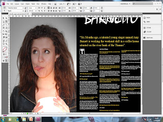
The Fonts, titles etc, become more efficient in terms of layout. In the preliminary task they fill little of the frame leaving, huge gaps, whilst in the finished pages, the text is spread out and layed efficiently, to make it easier on the eye and create the illusion that the magazine has more to offer within.


The background is also more important to the over all presentation in the final pages, as opposed to the pre lim pages. The background in the final pages is crafted in photoshop and plays more of a role in reflecting the conventions of the magazine, and emphasising the model via contrast. Whilst there appears to be no blatant purpose behind the background for the prelim task.


In the contents page, multiple images have been placed in with a central, rather big image, creating a better in depth show of the contents of the magazine as opposed to the prelim tasks one giant image, that offers little insight into the magazine.


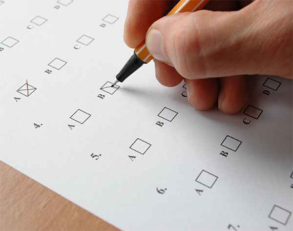
I have used sufficient deconstruction and research for my blog. A questionnaire and feedback was created and can be viewed on page 17 and 18 of my scrap book. The feedback of this was used and incorporated into my pages. For instance they said that they wanted a conventional image on the left, and text on the right. This was incorporated into my final pages as can be seen in previous blog posts.


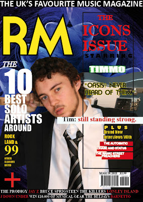
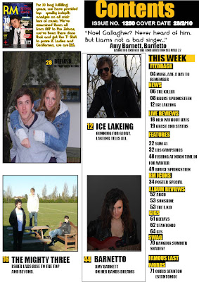
I have deconstructed and analysed magazine pages that are similar to my own. Such as below


using deconstructed pages, I gained value research and inspiration to incorporate into my finished pages, in order to appease my targeted teenage audiences, such as layout, language etc.


Tuesday 20 April 2010

My Double Page Spread


My double page spread was created using indesign and photoshop.


I wanted to create a double page spread that didn't patronise the audience with its language. Informal language was chosen deliberately, as this language has connotations of friendliness. and signifies a light hearted conversation between friends, not a conversation where one dictates information to the other, as that would be to resemblent of school for my targeted audience of teenagers. I wanted the double page spread to feature an interview that allowed the audience to associate wit the subject in question, and this too was achieved via the language. aforementioned questionnaire, gave me feedback that they wanted the conventional image on the left, text on the right as the juxtapositioning of them to form the interview whilst abiding convention signifies professionalism and expertise, which appeals to the secondary audience.

This is how i created my double page spread

I Started off by opening indesign, setting up 3 pages, and colouring the bottom two black. I then added a green rectangle using the rectangle tool on the left where i was to put my image from my camera. I then made titles under the font mistral, one bigger then the other, and placed them together, to get the desired title effect

I then imported the image in over the box, via my camera with a USB cable.

I then typed in the opening statement in large font, yellow text and speech brackets.

I then copy and pasted the text in from a Microsoft word document I had prepared and written a few weeks before.

Finally I changed some of the font colour to yellow. And this is the finished piece

My Contents Page


My contents page was constructed using indesign and photoshop.


My contents page, was generated via deconstruction of other famous music magazines contents pages such as KERRANG!. I deconstructed and evaluate the connotations of this KERRANG page and used the best qualities for my Contents Page.


The bright colour scheme had connotations of an optimistic ideology, and also of a sense of mixture, in the context of the magazines coverage. For instance a mixture of bright and dark colours could signify a unity between two ideologies, and thus a mixture of genres covered within the article. The colour scheme is also highly appealing, as it challenges the dark ,depressing, cool stereotype of the teenager of today, and in challenging stereotypes, gains favouritism amongst a niche crowd of young rebellious crowds. The Picture layout is very attractive. My research and questionnaire revealed that my target audience wanted multiple images on the contents page. (see page 27 of scrapbook), this manages to maintain the convention of having a large focal image, whilst also providing other images around its borders, signifying that the Big image is the Main article, whilst the small images are the "best of the rest".


KERRANG was a huge influence in the layout of my contents page. KERRANG have a proven track record by their circulation figure of around 40,000 weekly, most of these being teenagers. In order to emulate their success with my target audience, it was important, to obied by the conventions they had laid down on their contents page.


I wanted to incorporate a modern perspective ideology on my contents page, whilst still holding true to appeasing the target audience and allowing them to engage the magazine personally. Conventions were obtained from other magazines such as KERRANG! and ultimately, it was the layout ands images of the page that was the man attraction, for instance, I appeal to my audience, by making sure that all pictures in the contents page, were of fellow teenagers. This appeases them, as they are able to relate, and thus harbour a wish that, in their mind is realistic, of emulating these artists. Also, in putting several images rather than just one or two, the magazine appears to have more special features then perhaps it really does.

Here is how I created my contents page.

I started off by opening indesign and creating grey boxes, as markers to import my photos from camera into.


I then put in place all my images by importing them in via USB from my camera. A small image of the front cover was created by print sceening and cropping and this was put in the top left hand side. A Contents box was created by selecting the rectangle tool and creating, a black box, gold and white text was placed above it.

I then added in headings and numbers by using the text box and putting black/yellow rectangles behind them.


I then added in all the text.


Finishing up by putting text beneath the pictures and adding some below the contents box, and this is my final product.


The Usage of Technology


Throughout my media coursework, I have had to adapt and learn to use many different technological applications such as Photoshop, Indesign and Blogging, through the usage of these applications, I have learnt many skills that I have been able to use in my coursework.


Adobe Photoshop CS3 was key in constructing an artistic background and image for my front cover. I had to use many tools but none so more than the lasso tool. Indicated below


The lasso tool allows you to highlight a selection and cut it from the image. I did this on numerous occasions to crop images or simply to transfer sections into adobe indesign, please look into scrap book page 23. This tool was never too hard to use, as a it is also featured on free software such as paint.


My model was "air brushed" on photoshop, the spot healing brush was used to remove his freckles and spots, his eyes and teeth were also made brighter by the colour replacement tool.


My abstract background was created using photoshop, and it was an integral part of the front cover as it created the contrasting effect with the model photo. Here are some screenshots of how I made it using various render and filter tools that add an artistic design to a canvas.


Adobe indesign was crucial in the formation of my Double page spread, Contents page and front cover. It was the application that i used to set up the layout of my finished pages. In indesign, I changed font colours, set up text boxes, merged images, in brief, dictated the layout and structure of the pages. Here are some screenshots of my work on my contents page in indesign.


For the post production coursework, I have had to create a blog on all of my work throughout the term. Within this blog is proof of work, evaluations, analysis, research etc. There have been many tools I have used to make my Blog more advanced.


I Have learned to change the colour of fonts


I have learned to incorporate pictures


I have learned to incorporate videos

I have learnt to hyperlink websites http://www.google.co.uk/

My media coursework, as you would expect with a course entitled media, requires various different technological appliances to succeed in. Using technological convergance is also key when making a blog, demonstrated by the video above. Indesign, Photoshop and Blogger have taken getting use to, but have formed the basis of my AS coursework.

How I attracted my target audience

I used various methods to allow me to cater to my target audience. Various research includes questionnaires, audience feedback, and a physcological profile.

Here is my pyscological profile.


As you can see, the mooboard tend to slightly lean towards the male society. This is displayed via the rugby shot, stereotypical BMW car, PS3 etc. However, these are challenged by the more stereotypical feminine teenage alchopops, and the perhaps more feminine X factor with Icon Cheryl Cole. As you can below, the colour scheme of the front page is mainly darkened, more associated with the masculine society, but in order to make sure prejudice is not invoked amongst teenage girls, the headings tend to be bright colours, this is to show unity of the genders in the target audience and has connotations of equal representation. Note the mixture of colours on both contents, dps, and front pages.


Another key thing to note, is that, my target audiences are teenagers, and every picture featured is of a teenager. This has connotations of equality, and allows the audience to collect on a physcological level with the artists, thus becoming more motivated to read on.

Teenagers also have notoriously poor concentration levels. In a bid to adjust this, I have placed all the text in the DPS in yellow and white fonts with a black background. This emphasises via contrast, and maintains that the text is not boring and dull, therefore the short attention span is able to prolong its concentration due to over emphasis on the appearance of the text.

As you can see on page 15 - 16 - 17 of my scrap book, I created a questionnaire on all aspects of my magazine and received insightful feedback.


When asked about their ideal mast head, 100 % overwhelmingly responded that they wanted a mast head that reflected the age, as well as reflected the target audience and resembled the codes and conventions of the magazine.


The simplicity of the font signifies the magazines straight forward approach of its analysis of the musical genre. The font is called "Moderna" and thus obviously has connotations of the present modern era. The target audience are represented by the fact that the masthead RM are initials, shortening of two words. Therefore there language is directly referenced and they thereby are reflected in the masthead.


The questionnaire also showed that 50% wanted a balanced mixed colour scheme. In using the predominant reoccurring colours of yellow, black and white, this is safely seen to and their needs are appeased.


The questionnaire feedback informed that they would like the conventions to be stuck to when it came to the double page spread and that text should be on the right, image on the left, as you can see


On the left


On the right