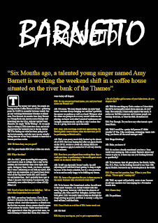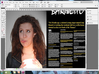

My double page spread was created using indesign and photoshop.
I wanted to create a double page spread that didn't patronise the audience with its language. Informal language was chosen deliberately, as this language has connotations of friendliness. and signifies a light hearted conversation between friends, not a conversation where one dictates information to the other, as that would be to resemblent of school for my targeted audience of teenagers. I wanted the double page spread to feature an interview that allowed the audience to associate wit the subject in question, and this too was achieved via the language. aforementioned questionnaire, gave me feedback that they wanted the conventional image on the left, text on the right as the juxtapositioning of them to form the interview whilst abiding convention signifies professionalism and expertise, which appeals to the secondary audience.
This is how i created my double page spread
I Started off by opening indesign, setting up 3 pages, and colouring the bottom two black. I then added a green rectangle using the rectangle tool on the left where i was to put my image from my camera. I then made titles under the font mistral, one bigger then the other, and placed them together, to get the desired title effect

I then imported the image in over the box, via my camera with a USB cable.
I then typed in the opening statement in large font, yellow text and speech brackets.
I then copy and pasted the text in from a Microsoft word document I had prepared and written a few weeks before.
Finally I changed some of the font colour to yellow. And this is the finished piece


No comments:
Post a Comment