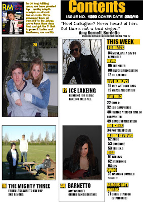

Since my completion of my preliminary task, i have advanced and improved my skills across a broad range of planning, deconstruction, construction, research and evaluating skills. Above are my final pages, see my scrap book page 2 and 3 for my preliminary task.
When the two sets of work are compared, there are blatant improvements.
The Fonts, titles etc, become more efficient in terms of layout. In the preliminary task they fill little of the frame leaving, huge gaps, whilst in the finished pages, the text is spread out and layed efficiently, to make it easier on the eye and create the illusion that the magazine has more to offer within.
The background is also more important to the over all presentation in the final pages, as opposed to the pre lim pages. The background in the final pages is crafted in photoshop and plays more of a role in reflecting the conventions of the magazine, and emphasising the model via contrast. Whilst there appears to be no blatant purpose behind the background for the prelim task.
In the contents page, multiple images have been placed in with a central, rather big image, creating a better in depth show of the contents of the magazine as opposed to the prelim tasks one giant image, that offers little insight into the magazine.
I have used sufficient deconstruction and research for my blog. A questionnaire and feedback was created and can be viewed on page 17 and 18 of my scrap book. The feedback of this was used and incorporated into my pages. For instance they said that they wanted a conventional image on the left, and text on the right. This was incorporated into my final pages as can be seen in previous blog posts.
I have deconstructed and analysed magazine pages that are similar to my own. Such as below
 using deconstructed pages, I gained value research and inspiration to incorporate into my finished pages, in order to appease my targeted teenage audiences, such as layout, language etc.
No comments:
Post a Comment