


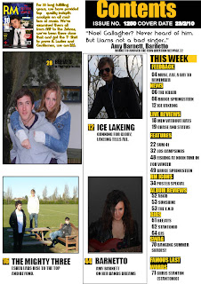
The bright colour scheme had connotations of an optimistic ideology, and also of a sense of mixture, in the context of the magazines coverage. For instance a mixture of bright and dark colours could signify a unity between two ideologies, and thus a mixture of genres covered within the article. The colour scheme is also highly appealing, as it challenges the dark ,depressing, cool stereotype of the teenager of today, and in challenging stereotypes, gains favouritism amongst a niche crowd of young rebellious crowds. The Picture layout is very attractive. My research and questionnaire revealed that my target audience wanted multiple images on the contents page. (see page 27 of scrapbook), this manages to maintain the convention of having a large focal image, whilst also providing other images around its borders, signifying that the Big image is the Main article, whilst the small images are the "best of the rest".
![]()
KERRANG was a huge influence in the layout of my contents page. KERRANG have a proven track record by their circulation figure of around 40,000 weekly, most of these being teenagers. In order to emulate their success with my target audience, it was important, to obied by the conventions they had laid down on their contents page.

I wanted to incorporate a modern perspective ideology on my contents page, whilst still holding true to appeasing the target audience and allowing them to engage the magazine personally. Conventions were obtained from other magazines such as KERRANG! and ultimately, it was the layout ands images of the page that was the man attraction, for instance, I appeal to my audience, by making sure that all pictures in the contents page, were of fellow teenagers. This appeases them, as they are able to relate, and thus harbour a wish that, in their mind is realistic, of emulating these artists. Also, in putting several images rather than just one or two, the magazine appears to have more special features then perhaps it really does.
Here is how I created my contents page.
I started off by opening indesign and creating grey boxes, as markers to import my photos from camera into.
I then put in place all my images by importing them in via USB from my camera. A small image of the front cover was created by print sceening and cropping and this was put in the top left hand side. A Contents box was created by selecting the rectangle tool and creating, a black box, gold and white text was placed above it.
I then added in headings and numbers by using the text box and putting black/yellow rectangles behind them.
I then added in all the text.

Finishing up by putting text beneath the pictures and adding some below the contents box, and this is my final product.
No comments:
Post a Comment